Why having a mobile-friendly website is important?

Having a mobile-friendly website is important because it ensures that your website can be easily accessed and used on mobile devices. With the increasing popularity of smartphones and tablets, more and more people are using mobile devices to browse the internet. According to a report by comScore, mobile devices account for more than 60% of digital media time spent.

Additionally, Google has stated that mobile-friendliness is a ranking factor for search engine results, which means that a mobile-friendly website is more likely to appear at the top of search engine results. This is important as Google reports that more than half of web traffic comes from mobile devices.

Moreover, a mobile-friendly website can improve user experience and engagement. A study by Google found that 61% of users are unlikely to return to a mobile site they had trouble accessing and 40% visit a competitor’s site instead. Also, a study by Google and Ipsos MediaCT reported that mobile-friendly sites see a 67% higher likelihood of purchase.

In summary, having a mobile-friendly website is crucial for reaching and engaging with a mobile audience, improving search engine visibility, and increasing conversion rate.

Sources:

Tips and best practices for addressing these issues and improving a website’s mobile-friendliness

Here are some tips and best practices for addressing mobile-friendliness issues and improving a website’s mobile-friendliness:

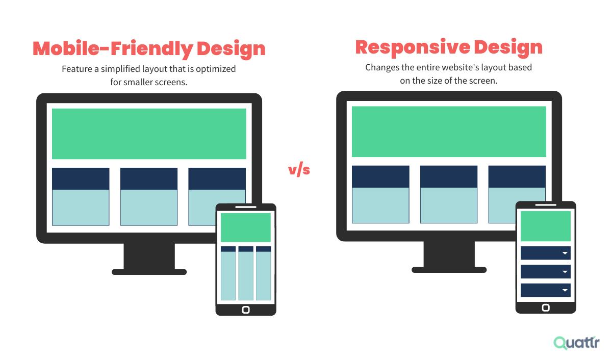
  1. Use a responsive design: A responsive design adapts the layout of a website to fit different screen sizes and resolutions. This ensures that the website looks and functions well on all devices.
  2. Optimize images and videos: Large images and videos can slow down a website’s load time on mobile devices. Optimize images by compressing them and using web-friendly file formats, and use HTML5 video instead of Flash.
  3. Use a mobile-friendly navigation: Make it easy for users to navigate your website on a small screen by using a simple navigation menu, large buttons, and a search bar.
  4. Keep the content simple: Simplify the content of your website by using a clear and easy-to-read font, plenty of white space, and short paragraphs.
  5. Test your website on different devices: Test your website on different devices and browsers to make sure it looks and functions correctly on all of them.
  6. Keep an eye on your analytics: Use tools like Google Analytics to monitor the behavior of your mobile visitors and identify any issues that need to be addressed.
  7. Improve the page load speed: Use tools like Google’s PageSpeed Insights to analyze the page load speed of your website and identify areas for improvement.
  8. Use Google Search Console to see how your website is performing on mobile devices, and use the Mobile Usability report to fix any issues.

By following these tips and best practices, you can improve the mobile-friendliness of your website and provide a better user experience for mobile users.

How should a company approach their online presence?

Remember when having a website was enough? Now, your competitors have online booking, instant quotes, and slick mobile designs. What if building a business website was actually straightforward? This comprehensive small business web design guide cuts through the confusion, showing you exactly what works best for small business websites today.

Understanding Your Website Needs


While small business web design might seem straightforward, creating a website that truly serves your customers takes careful planning. Before we explore platforms and designs, let’s focus on what makes small business websites work in today’s market.

Homepage That Hooks


Your homepage must instantly answer three vital questions: what you offer, who it’s for, and why visitors should care. Instead of overtly relying on flashy animations or text walls, treat your homepage like a focused conversation with potential customers. Lead with headlines that address specific needs rather than just stating your business name.

About Page That Builds Trust


Most About pages fail by defaulting to generic mission statements and corporate headshots instead of building genuine connections. Transform your business by sharing the authentic story behind it — whether it started with personal frustration or a market gap you discovered. Rather than hiding behind corporate jargon, demonstrate your real impact through specific achievements and customer successes. By showing genuine team moments and how you’ve helped others overcome similar challenges, visitors will see trusted advisors rather than just another service provider.

Contact Information That’s Easy to Find


Your contact page should eliminate friction between interest and action, not just list contact details. Offer multiple contact methods with clear context about when to use each, including response times and business hours.

Fast Loading Times


Imagine waiting for a restaurant’s menu — after about 20-30 minutes, you’d likely order elsewhere. The same happens with websites, where 47% of visitors expect pages to load in under two seconds. Successful small business web design relies on converting visitors into customers.


While big brands retain customers through loyalty, small businesses must excel at speed to compete. This means optimized images, clean code, and quality hosting — not budget plans that save pennies but cost customers. With Google now ranking sites on speed, fast loading isn’t optional — it’s essential for keeping visitors from bouncing to competitors.


Mobile-First Navigation


With mobile users representing over 60% of web traffic, smooth phone navigation isn’t optional — it’s crucial for business success. Your mobile design should understand how people actually use phones to interact with your business, whether checking hours during lunch or finding directions on the go.


Every interaction should feel natural, with easily tappable buttons, clear information hierarchy, and touch targets sized for real fingers. The goal isn’t to shrink your desktop site but to create an experience that keeps mobile visitors focused on their tasks rather than struggling with navigation.


Clear Calls-To-Action


Your business website needs clear conversion paths, unlike subtle artistic designs. Effective calls-to-action guide visitors naturally by appearing exactly where they’re most likely to act. Instead of showing every possible option, prioritize actions based on customer journey stages – like “Book Now” on your homepage and “Get a Quote” on service pages.

Jawbone: the Rise and fall of the First Wearable Technology Company


One of the most innovative companies of the mid-2000s, Jawbone pioneered wearable technology with UP, the first wrist-worn fitness tracker. And it revolutionized sound with the first smart smart bluetooth headset and then with Jambox, the first smart wireless speaker. But product malfunctions, weak gross margins, inflated valuations and financing troubles would reverse Jawbone’s meteoric rise. In one of the most dramatic turns in Silicon Valley history, the company went from a nearly $4 billion valuation to liquidation. Read the rest of the story here….

Color combination 101


Hippie color palettes are making a vibrant comeback, infusing modern design with a nostalgic touch of the 1960s and 70s. These palettes are characterized by their bold, earthy tones and psychedelic hues.

From fashion to graphic design, the influence of hippie color schemes is undeniable. They bring a sense of freedom, creativity, and individuality to any project.

Tips For Creating Hippie Color Palettes

Designing with hippie color palettes can be both exciting and challenging. Here are some practical tips to help you create stunning designs:

  • Balance Bold and Neutral Tones: Use bold, vibrant colors sparingly and balance them with neutral tones to avoid overwhelming the viewer.
  • Match Complementary Shades: Pair colors that are opposite each other on the color wheel to create a harmonious and visually appealing design.
  • Incorporate Earthy Hues: Integrate earthy tones like browns, greens, and ochres to ground your design and add a natural feel.
  • Use Gradients for Depth: Employ gradients to blend colors smoothly and add depth to your design, making it more dynamic.
  • Test Versatility: Ensure your color palette works well across different mediums, from digital screens to print materials, to maintain consistency.
  • Experiment with Patterns: Combine your color palette with patterns inspired by the 60s and 70s to enhance the retro vibe of your design.

Design and Search Engine Optimization (SEO) need to work together

Why Design & SEO Need To Work Together

The relationship between web design and SEO has evolved far beyond the days of keyword-stuffed HTML pages. Google now evaluates entire website experiences, from load times to user navigation patterns, making design choices crucial for search success.

User behavior tells the real story. A slow, cluttered website triggers immediate bounces, while clean, fast-loading designs keep visitors engaged. These engagement metrics directly influence search rankings, turning design elements into powerful SEO signals.

Clean navigation menus reduce bounce rates, while mobile-friendly designs create higher engagement rates. These statistics demonstrate why web design and SEO must be considered interconnected rather than separate disciplines. Beyond surface metrics, thoughtful design naturally strengthens core SEO elements. Well-structured layouts encourage internal linking, create clear content hierarchies, and enhance user experience. These design foundations help search engines better understand and rank content.

The fusion of design and SEO creates a powerful fusion. Design isn’t limited to aesthetics, just as SEO extends beyond keywords. Together, they form the backbone of user experience — the critical factor in human engagement and search engine success.


Essential Web Design Principles That Boost SEO

The intersection of design and SEO lies in measurable elements impacting user experience and search rankings. Rather than treating these as separate considerations, successful websites integrate key design components that naturally boost SEO performance. Let’s explore the essential design components that directly influence your SEO success:


1. Mobile-First Layout & Responsiveness

Mobile design has evolved beyond simple responsive breakpoints. Starting with mobile constraints creates leaner, focused experiences that perform well across devices. This approach strips unnecessary elements while emphasizing what matters for engagement.

Touch targets become intentional, typography scales smoothly, and layouts adapt intelligently for seamless experiences. When mobile optimization leads design decisions, the result brings cleaner code, faster load times, and better user engagement.

These improvements directly impact search rankings while delivering experiences working effortlessly across screens. Proper mobile design means considering every interaction, from button placement to content flow, ensuring optimal performance everywhere.

2. Page Speed & Performance

Speed shapes every aspect of website success, from user engagement to search rankings. Modern performance optimization balances visual impact with loading times, creating experiences that feel instant without sacrificing quality.

Smart resource handling, efficient code delivery, and optimized media management maintain quick response times. Core Web Vitals influence rankings by measuring real user experiences through load speed, interactivity, and visual stability.

Performance extends beyond basic optimization to interactive elements, ensuring smooth animations and responsive features. When speed optimization works correctly, it creates seamless experiences that keep users engaged while satisfying search engine requirements.


3. Navigation Structure

Navigation is your website’s roadmap, and like any good map, it needs to be clear, accurate, and easy to follow. Too many websites hide their best content behind confusing menus or trendy navigation that leave users scratching their heads.

On the other hand, some websites with very prominent navigation don’t blend into the rest of the content and are very distracting.

The most effective navigation systems fade into the background, letting users find content without conscious effort. Clear hierarchies, intuitive labels, and consistent patterns encourage deeper site exploration and stronger engagement signals.

Navigation extends beyond menus to include breadcrumbs and internal linking that strengthen engagement. When navigation works well, users explore more pages and find information easily. These positive signals boost search rankings while creating better experiences. Good navigation considers user flow, content hierarchy, and search engine crawlability, ensuring every page serves its purpose.

4. Visual Hierarchy

Among the most crucial web design and SEO elements is visual hierarchy, which helps users and search engines understand the importance of content. Visual hierarchy makes complex information digestible and key actions obvious. Through spacing, typography, and color, content relationships become clear and intuitive. Strong hierarchical design improves both aesthetics and user engagement, helping search engines understand content importance.

Headers guide readers through the main points while supporting content flows naturally beneath. Subtle design elements like opacity, shadows, and selective animation reinforce content hierarchy without compromising performance.

When visual hierarchy works well, users engage more deeply with content, while search engines better understand page structure. Effective hierarchy creates clear pathways through information, enhancing both usability and SEO.


Implementing These Design Principles: The Right Tools Matter


While understanding these web design and SEO principles is crucial, executing them effectively requires the right tools. Many website builders promise the world but deliver bloated code and poor performance. Others offer clean code but make design implementation painfully complex. This is where choosing the right foundation becomes critical.