Remember when having a website was enough? Now, your competitors have online booking, instant quotes, and slick mobile designs. What if building a business website was actually straightforward? This comprehensive small business web design guide cuts through the confusion, showing you exactly what works best for small business websites today.
Understanding Your Website Needs
While small business web design might seem straightforward, creating a website that truly serves your customers takes careful planning. Before we explore platforms and designs, let’s focus on what makes small business websites work in today’s market.
Homepage That Hooks
Your homepage must instantly answer three vital questions: what you offer, who it’s for, and why visitors should care. Instead of overtly relying on flashy animations or text walls, treat your homepage like a focused conversation with potential customers. Lead with headlines that address specific needs rather than just stating your business name.
About Page That Builds Trust
Most About pages fail by defaulting to generic mission statements and corporate headshots instead of building genuine connections. Transform your business by sharing the authentic story behind it — whether it started with personal frustration or a market gap you discovered. Rather than hiding behind corporate jargon, demonstrate your real impact through specific achievements and customer successes. By showing genuine team moments and how you’ve helped others overcome similar challenges, visitors will see trusted advisors rather than just another service provider.
Contact Information That’s Easy to Find
Your contact page should eliminate friction between interest and action, not just list contact details. Offer multiple contact methods with clear context about when to use each, including response times and business hours.
Fast Loading Times
Imagine waiting for a restaurant’s menu — after about 20-30 minutes, you’d likely order elsewhere. The same happens with websites, where 47% of visitors expect pages to load in under two seconds. Successful small business web design relies on converting visitors into customers.
While big brands retain customers through loyalty, small businesses must excel at speed to compete. This means optimized images, clean code, and quality hosting — not budget plans that save pennies but cost customers. With Google now ranking sites on speed, fast loading isn’t optional — it’s essential for keeping visitors from bouncing to competitors.
Mobile-First Navigation
With mobile users representing over 60% of web traffic, smooth phone navigation isn’t optional — it’s crucial for business success. Your mobile design should understand how people actually use phones to interact with your business, whether checking hours during lunch or finding directions on the go.
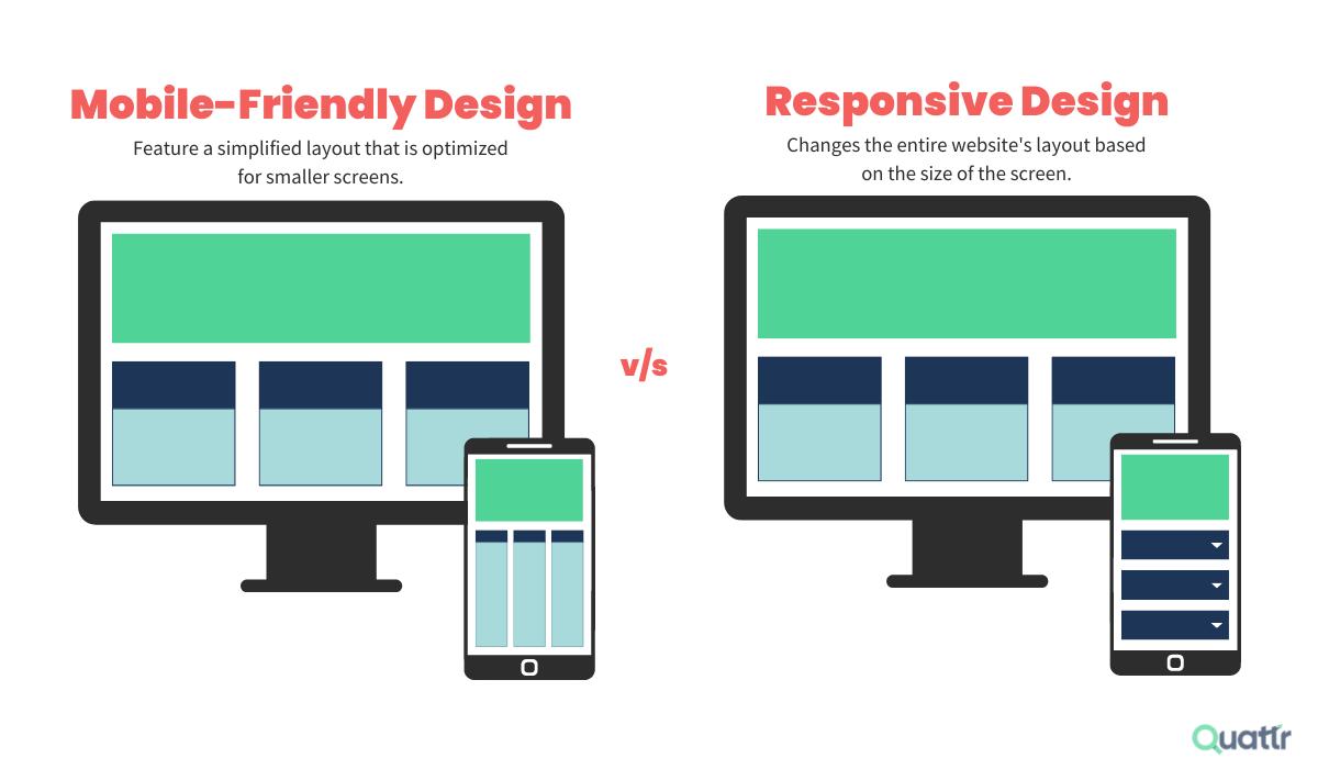
Every interaction should feel natural, with easily tappable buttons, clear information hierarchy, and touch targets sized for real fingers. The goal isn’t to shrink your desktop site but to create an experience that keeps mobile visitors focused on their tasks rather than struggling with navigation.
Clear Calls-To-Action
Your business website needs clear conversion paths, unlike subtle artistic designs. Effective calls-to-action guide visitors naturally by appearing exactly where they’re most likely to act. Instead of showing every possible option, prioritize actions based on customer journey stages – like “Book Now” on your homepage and “Get a Quote” on service pages.


 Having a mobile-friendly website is important because it ensures that your website can be easily accessed and used on mobile devices. With the increasing popularity of smartphones and tablets, more and more people are using mobile devices to browse the internet. According to a report by comScore, mobile devices account for more than 60% of digital media time spent.
